

Brian Mercer never backs down from a challenge.
When people told him there was no way to get the exact subtle sweetness of old-world beers in the U.S., he flew to Belgium and started a company to import an elusive type of sugar for American brewers. When he wanted to use that same sugar to brew his own Belgian beer recipes but couldn’t afford to open a brewery, he spent days driving up and down Interstate 5 to brew, bottle and distribute from a contract brewer in the Bay Area.
And when he finally opened Brouwerij West in a port-side WWII-era warehouse in his hometown of San Pedro three years ago, he knew he wanted to make his new dream slate of mixed-fermentation beers reflect both a reverence for the past and an eye towards the future.
Enter the million-sticker projects.
“I walk in with an idea and everyone says, ‘It won’t work. That’s not happening,’” Mercer said recently as he threaded a roll stamped with hundreds of iridescent coin-sized stickers through a labeling machine originally built to wrap one long, wide sticker around single cans.
“But then I show [the machine producers] some of my research and tell them about what we’ve done before and they relent. Still, they can only do so much for us. You have to figure the rest out on your end.”

Mercer, a self-proclaimed “failed artist”, is co-owner and de-facto art director of Brouwerij West, an independent brewery whose penchant for creative beers (think: rustic saisons roiled with fresh sea air and coffee-infused pilsners, peppered with herbaceous German hops) is matched only by its equally as creative packaging.
While most breweries are complacent to design a basic branded rectangular label and quickly run cases through a standard labeler machine to apply them, Brouwerij West’s specialty release cans are works of art in the truest sense of the term.
Created in collaboration with local and international illustrators, painters and muralists that Mercer seeks out and negotiates pay for their art, each label is comprised of dozens of die-cut stickers—from rainbow circles to metallic foil clouds—that, in order to achieve the full creative vision (and, often, to be readable), need to be meticulously, agonizingly and down-to-the-millimeter applied then layered atop each other on a fickle aluminum surface.
The secret is not only in the shapes, sizes and spaces between the stickers themselves but also in the specific tension on the labeling machine, the speed of the belt, the timing of when the machine releases the can and more.
It’s a fiscally irresponsible feat that only happens because Mercer convinced his label maker to print the custom labels and then tricked the labeling machine into producing his vision for disposable beer vessels that double as 3D sculptures.
“It’s cheaper and it’s easier to label a can the regular way, but isn’t that the whole point of art, really?” Mercer said, citing Andy Warhol’s penchant for transforming everyday objects into works of art. “We’d be labeling these cans anyway, so why not? Sure, we could do without it, but why?”
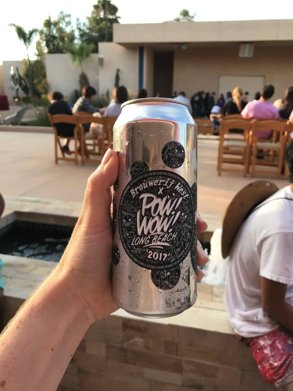
The first label known to be created in this style was for a batch of Brouwerij West’s Picnic Lightning IPA, brewed to be distributed as the official beer of POW! WOW! Long Beach in 2017. Like all the other year-round beers at the time, the cans of Picnic Lightning came with a circular, artist-drawn label, about the size of a beer coaster.
POW! WOW! organizers sent Mercer a piece of art to use for the new label; a wide, flat, continuous design by the event’s founder, Jasper Wong. To set this special release apart from the other iterations of Picnic Lightning, though, Mercer decided to do something more cookie-cutter style, where you stamp shapes into the image, then pull the rest away (“like when I’m home baking with the kids”).
Because his usual mobile cannery was not equipped to execute the kind of precarious labeling he envisioned, Mercer found a local company that made analog, single-load label-applicators and drove there to try and explain what he wanted to do. The confused owner listened, then doubted, Mercer says, then swapped out parts on a machine he thought might help.
“I was driving to the printer on canning day not even knowing if it would even print, much less work on our label machine,” Mercer said. “Our original single labeler was custom built in a day.”
A few months later, Mercer worked with Los Angeles-based street artist Triston Eaton to create the label for another special-release IPA, Falling Water. Each can is covered in multiple layers of small, colorful circles, revealing colorful streaks and portions of a woman’s face that force your brain to fill in the gaps between. With 63 stickers per can and 650 cases of beer to label, the Brouwerij West crew lovingly called Falling Water the “million sticker project.”
“You see the artist before you see our brand,” Mercer said proudly of his brewery’s labels. “If I can get a real piece of art into someone’s hand, that’s powerful. Because if you’re over 21, you drink beer, but who goes to museums anymore?”
A year and a half after the first experiment, Brouwerij West are the undisputed experts in the art of ambitious beer can labeling. They upgraded their machine to one that can handle multiple cans in an assembly line, and are averaging about one specialty release per month.
At the start of an intense labeling day last month, Mercer put on his reading glasses and gingerly threaded the white paper roll through the machine. He tweaked tension arms, pressed some buttons, tapped on a screen from his upside-down vantage point and twirled the roll until two feet worth of stickers were ready to apply on the first can.
“Want to see if it works?” he said with a grin.

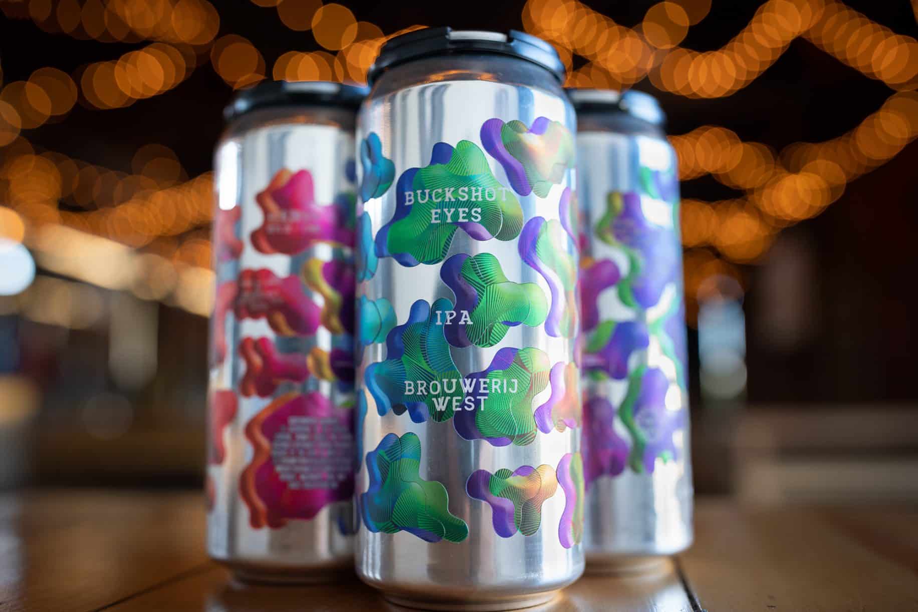
The first one was off by a few millimeters—the letters didn’t match up and the name of the beer, Buckshot Eyes, was gibberish. Tweak tension, press buttons, adjust spool. The second one didn’t even prompt the stickers to release from the paper and the silver can rolled to the end of the line naked. The third one missed the stickers entirely, causing them to fly off—thwap thwap thwap—and flitter to the ground, like a card shuffler gone awry. Soon, eight cans were lined up, each one a millimeter closer to overlap perfection.
“See, it takes a few,” he said, still fiddling with touch screens and knobs, as a painter would when mixing gouache to get the right glint of green.
It took a case or so for the labeler to tap into what Mercer wanted it to do, for the nearly 100 stickers to align and layer into the intended psychedelic sky of foil clouds. The beer inside is an IPA of malted, flaked and chit barley hopped with Citra, Azaca, El Dorado and Simcoe hops, a creative mix that’s indicative of Mercer’s eccentric brewing style. But when it comes to Buckshot Eyes’ unorthodox label, this is only the beginning.
“It’s like a piano,” Mercer said of the technique he’s pioneered, “and we’re only playing a few keys right now.”